anchorAbout mobi.MED
mobi.MED offers an all-in-one software solution for doctors' practices in Austria and Germany. It includes features for appointment booking, management, invoice and payment tracking, as well as documentation of diagnoses, treatments, and medication.
anchorThe Challenge
The team at mobi.MED encountered challenges after a period of rapid growth. The codebase had built up technical debt, which made maintenance and onboarding of new engineers tough. The application was also complex with an inconsistent UI/UX, making it harder to use. To solve these problems, mobi.MED reached out to Mainmatter to modernize the codebase and revamp the UI. The objectives were to streamline the code and put in place a design system which would ease collaboration between designers and engineers, and standardize the application's UI/UX.
anchorSetting the Stage: Simplification and Modernization
We started by updating and simplifying the codebase. We methodically updated old dependencies to newer versions. While doing this, we replaced outdated patterns with modern best practices, and guided the client's team through these changes. This streamlined the workflow, and made onboarding new team members easier, while also removing user-facing bugs.
anchorA Fresh Look
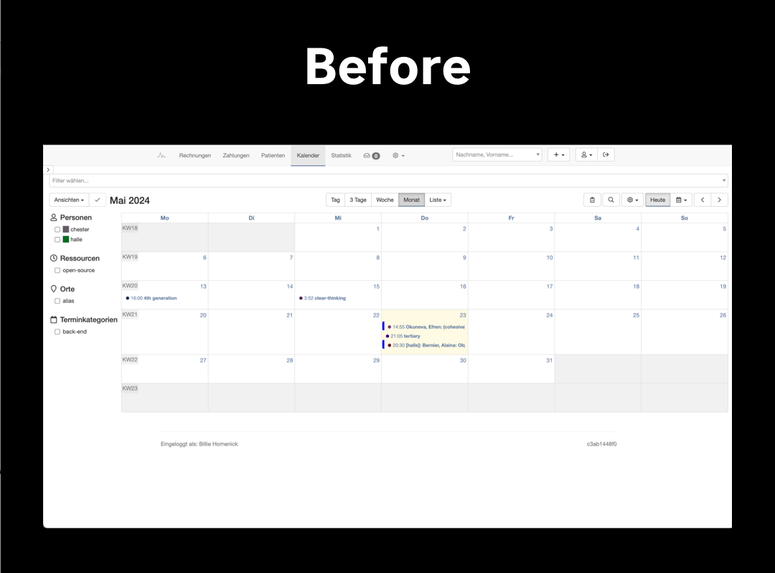
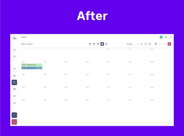
Our design expert began with a branding exercise to establish the brand identity, determining essential elements like colors and fonts. The design system was then built from the ground up, starting with basic components like buttons and inputs. We then designed groups of these basic components, incorporating spacing and layout rules. Finally, our team redesigned entire screens of the application.
anchorDesign Implementation
While the design work was ongoing, our engineering team already prepared developer tools for the implementation of the redesign. We set up a structure for documenting components and their APIs, and implemented visual regression testing with Argos CI to prevent unnoticed visual changes. With this infrastructure, we could confidently apply the design system across the application, ensuring the existing UI remained intact.
The first step involved unifying components and related styles. We merged multiple instances of elements like buttons into single, shared components. This not only unified the UI but also simplified the codebase. Next, we extracted new components for complex elements such as drawers and navigation. Finally, we refactored complex screens like the timeline and calendar.
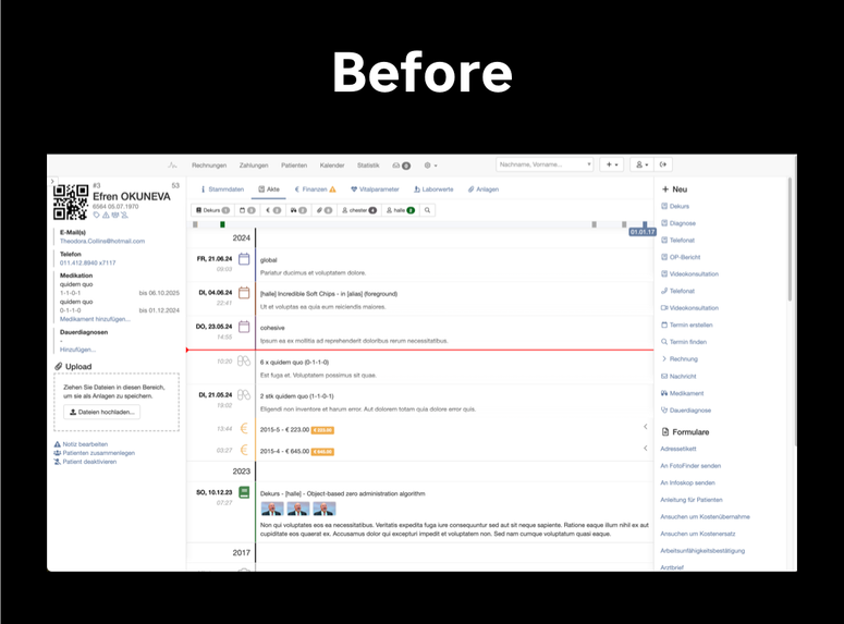
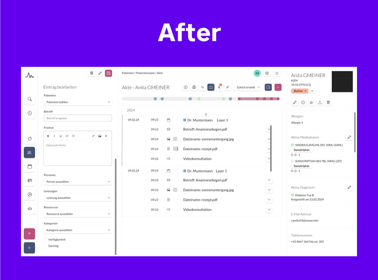
Our team progressed through the project step-by-step. We split the work into small, short-lived branches which allowed us to transform the codebase without disrupting the client team's work. We used feature flags to prevent incomplete visual changes from being exposed to real users while the implementation of the design system was ongoing.
anchorIn Better Shape for the Future
The UI refresh, based on the design system, simplified codebase, and developer infrastructure, is now straight-forward to complete. Our experts continue to support mobi.MED, both by actively contributing but also by offering guidance and mentoring to their team.
Mainmatter allowed us to keep shipping features, while simultaneously eliminating technical debt and educating the team. We kept extending the contract because of the tremendous value they brought. In later stages, we implemented a new design system together and seamlessly tackled long standing ux bugs along the way. Also it was fun.
